
In modern web development, ReactJS has become one of the most popular and powerful JavaScript libraries for building user interfaces (UIs). One of the core concepts that makes ReactJS so effective is the idea of components. Components allow developers to build reusable, modular UI elements that help organize complex applications and improve maintainability.
In this article, we’ll explore what ReactJS components are, why they are important, and how to create reusable UI elements that enhance both the development process and the user experience.
What Are ReactJS Components?
In React, everything is a component. A component is a self-contained, reusable piece of code that defines a part of the UI and its behavior. Each component can have its own logic, structure, and styling, and they can be composed together to create complex interfaces.
React components can be of two main types:
-
Functional Components: These are simpler components written as functions. They can receive props (inputs from parent components) and return JSX (a syntax extension that allows you to write HTML-like code within JavaScript).
-
Class Components: These are more traditional components written as ES6 classes. They provide additional features like state and lifecycle methods, although functional components can now achieve similar functionality using hooks (introduced in React 16.8).
For most modern React development, functional components are preferred due to their simplicity and the ability to manage state and side effects using hooks like useState and useEffect.
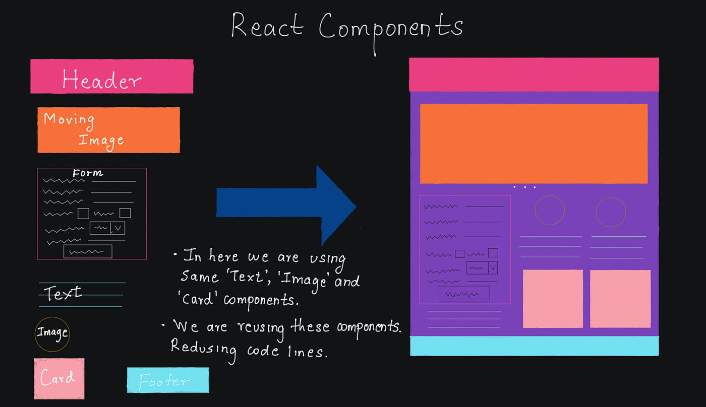
The Importance of Reusable Components
One of the key strengths of ReactJS is the ability to build reusable components. Reusable components are essential for maintaining a clean, modular, and scalable codebase. Here’s why they are so important:
-
Maintainability: Reusable components make it easier to maintain and update your application. If a UI element needs to change (e.g., a button style or the layout of a card), you only need to make the change in one place, and it will be reflected wherever that component is used.
-
Consistency: Reusable components help ensure a consistent look and feel across your application. When you create a component for a button, for instance, you can be sure that every instance of that button will behave and appear the same way.
-
Separation of Concerns: By breaking down the UI into smaller, self-contained components, you make it easier to focus on individual pieces of functionality. Each component has its own logic and rendering, which makes it easier to test, debug, and understand.
-
Efficiency: React’s virtual DOM and reconciliation algorithm allow for efficient re-rendering of components. When components are reusable, React can update only the necessary components rather than re-rendering the entire page, leading to better performance.
-
Collaboration: Reusable components allow different teams (or developers) to work on separate parts of the UI independently. Each team can focus on building components that will be used across the application, promoting modularity and scalability.
Building a Simple Reusable Component in React
Let’s walk through an example of how to create a reusable button component in React.
1. Functional Button Component Example:
In this simple example, we’ve created a Button component that takes three props:
text: The text to be displayed inside the button.onClick: A function that will be called when the button is clicked.style: Inline styling to customize the button’s appearance.
Now, you can use this button component in various places of your application like this:
Here, we use the Button component twice with different text and styles, showing how a single reusable component can be customized and used in multiple places.
2. Extending the Button with More Features:
You can enhance the Button component by adding more features like default values, type (submit, reset), and disabled states.
Here we added:
type: Defaults to “button” but can be changed to “submit” or “reset”.disabled: A prop to disable the button if needed.className: A CSS class for styling, which allows for global CSS styles.
Passing Data and Handling State in Reusable Components
A key benefit of React components is the ability to manage state and pass data between components. React’s state allows components to maintain their own data and react to user inputs. Here’s an example of a reusable input component:
3. Reusable Input Component Example:
This component can be used in a form like this:
In this example:
- The
InputFieldcomponent is used to create reusable input fields. - The parent
Formcomponent manages the state of the input (usinguseState) and passes it as props toInputField.
Tips for Building Reusable UI Components
-
Make Components Small and Focused: Try to keep components focused on a single task. This makes them easier to understand, maintain, and reuse.
-
Use Props for Customization: Use props to make components customizable.
-
Leverage Default Props: Set default values for props where necessary.
-
Avoid Hard-Coding Values: Refrain from hard-coding values into your components. Instead, pass dynamic values as props or use state to ensure flexibility.
-
Use React Context for Global Data: For components that need to share data or state across multiple levels of your app, consider using React Context for global state management.
-
Style Components Using CSS-in-JS: Tools like styled-components or emotion allow you to keep styles scoped to components, reducing conflicts in large applications.
-
Prop-Types for Validation: Use PropTypes or TypeScript to validate the types of props passed to components. This helps catch potential issues early in development.
Conclusion
React components are a powerful way to build reusable UI elements that help organize and simplify your code. By breaking down complex UIs into smaller, manageable pieces, you can improve maintainability, reusability, and efficiency in your applications. Whether you are building a button, form input, or complex UI elements, following the principles of modularity and reusability can make your development process smoother and more effective.
By mastering component design and understanding how to create flexible, reusable elements, you can unlock the full potential of React and build scalable, efficient, and high-quality web applications.


