
In modern web development, CSS Grid Layout has revolutionized the way designers and developers create responsive, flexible, and visually appealing layouts. With its powerful grid-based system, CSS Grid provides complete control over page structure, allowing elements to align seamlessly across different screen sizes.
But what makes CSS Grid a game-changer? How does it compare to other layout techniques like Flexbox? In this guide, we’ll dive into the fundamentals of CSS Grid, its key properties, and best practices for building fully responsive web designs.
What is CSS Grid Layout?
CSS Grid is a two-dimensional layout system that enables developers to arrange elements both horizontally (rows) and vertically (columns) with precision. Unlike traditional layout techniques (like floats or Flexbox), CSS Grid simplifies complex designs, making it easier to create structured and adaptable layouts.
Key Advantages of CSS Grid:
- Two-Dimensional Control – Unlike Flexbox, which is primarily one-dimensional, Grid allows control over both rows and columns simultaneously.
- Less Code, More Power – Reduces the need for unnecessary nested divs, making layouts cleaner and more maintainable.
- Flexible and Responsive – Adapts easily to different screen sizes without relying on media queries.
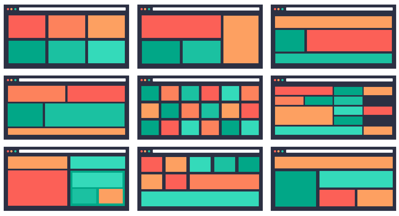
- Grid-based Design Systems – Ideal for dashboard layouts, magazine-style designs, and e-commerce grids.
📌 Fun Fact: CSS Grid was officially introduced in CSS3 and became widely supported across browsers in 2017.
2. Understanding CSS Grid Basics
Before diving into complex layouts, let’s start with the fundamentals of CSS Grid.
A. Setting Up a Grid Container
To use CSS Grid, define a grid container using display: grid;:
This creates a 3-column, 2-row grid with a 10px gap between items.
B. Defining Grid Tracks (Columns & Rows)
CSS Grid allows precise control over column and row sizes using grid-template-columns and grid-template-rows:
✔ fr (fractional unit) automatically adjusts the grid size based on available space.
✔ auto ensures rows expand based on content size.
📌 Pro Tip: Use repeat() to simplify column definitions:
3. Placing Items in the Grid
CSS Grid provides multiple ways to position elements inside the grid.
A. Using Grid Lines for Placement
Items can be placed by specifying grid-column and grid-row start and end points:
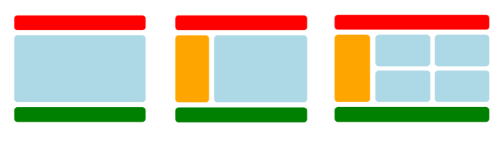
B. Spanning Multiple Columns & Rows
✔ This is useful for highlighted sections, featured content, or asymmetric layouts.
📌 Fun Fact: Grid line numbers start from 1 (not 0), making positioning easier to understand.
4. Responsive Design with CSS Grid
One of the biggest strengths of CSS Grid is its ability to create fully responsive layouts with minimal effort.
A. Using auto-fit and auto-fill for Dynamic Columns
Rather than defining fixed column sizes, use auto-fit or auto-fill for responsive behavior:
✔ minmax(150px, 1fr) ensures columns never shrink below 150px but expand as needed.
✔ auto-fit fills the available space with as many columns as possible.
B. Creating a Fully Responsive Layout
Combine Grid with media queries for better mobile responsiveness:
📌 Pro Tip: Use grid-template-areas to simplify complex layouts in a responsive manner.
5. CSS Grid vs. Flexbox: When to Use Each
Many developers confuse CSS Grid with Flexbox, but they serve different purposes:
| Feature | CSS Grid | Flexbox |
|---|---|---|
| Layout Type | Two-dimensional | One-dimensional |
| Best For | Whole page layouts | Aligning items in a row/column |
| Alignment | Grid-based | Content-based |
| Complexity | More structured | More flexible |
✔ Use CSS Grid for overall page layouts, dashboard designs, and structured components.
✔ Use Flexbox for smaller UI elements like navbars, buttons, and form layouts.
📌 Did You Know? You can combine Grid and Flexbox for advanced layouts!
6. Best Practices for CSS Grid Layouts
To maximize the benefits of CSS Grid, follow these best practices:
- Use
frunits instead of fixed pixels for flexible columns. - Avoid excessive nesting – Keep your grid structure simple.
- Use
grid-template-areasto create visually organized layouts. - Combine CSS Grid with Flexbox for optimal layout control.
- Leverage browser dev tools (
Inspect Element) to visualize your grid.
📌 Pro Tip: Use grid-auto-flow: dense; to automatically fill empty spaces in the grid.
Conclusion
CSS Grid has transformed web layout design, offering a powerful and efficient way to build responsive, structured, and visually appealing layouts. Whether you’re designing a dashboard, an e-commerce page, or a dynamic blog layout, CSS Grid gives you full control over page structure.
🔥 So start experimenting with CSS Grid and take your responsive design skills to the next level! 🚀🎨


