JAKARTA, cssmayo.com – Dark Patterns: Deceptive Design in Digital Interfaces might sound super dramatic, but trust me—it’s no joke. I’ve run into these sneaky designs way more than I’d like. Real talk: everyone who’s ever clicked around the web has probably fallen for a Dark Pattern at least once.
In an ideal world, interfaces guide us transparently toward our goals. But Dark Patterns abuse human psychology to manipulate choices—maximizing clicks, subscriptions, or data collection at the user’s expense. In this deep dive, I’ll define Dark Patterns, chart their rise, share hard-learned lessons from my own projects, and offer ethical guidelines and detection techniques so you can both avoid and call out these harmful tactics.
What Are Dark Patterns?

Dark Patterns are intentional design choices that steer users into actions they might not otherwise take—often benefiting the business rather than the individual. They exploit cognitive biases such as scarcity, social proof, and fear of missing out.
Common categories include:
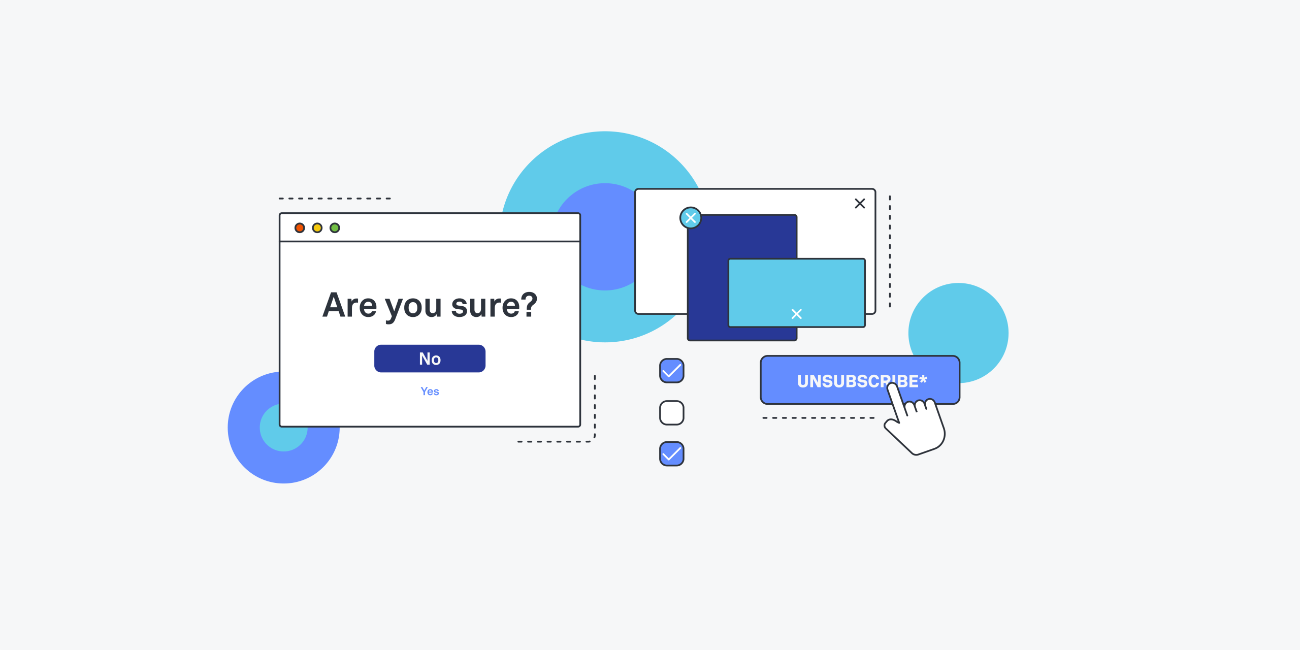
- Confirmshaming: Guilt-inducing copy (“No, I hate saving money”)
- Roach Motel: Easy to sign up, hard to cancel
- Sneak into Basket: Adding extra items or fees by default
- Forced Continuity: Free trial auto-converts to paid without warning
- Hidden Costs: Fees revealed only at final checkout
- Misdirection: Obscuring the “No thanks” button in a checkout flow
Why Dark Patterns Matter
- Erodes trust and damages brand reputation
- Frustrates and deceives users, sometimes triggering legal scrutiny
- Raises ethical concerns around autonomy and consent
- Contributes to user fatigue and “banner blindness” in digital products
- Prompts regulation (e.g., GDPR, California’s CPRA) penalizing manipulative interfaces
Timeline: The Evolution of Dark Patterns
| Era | Milestone | Impact |
|---|---|---|
| Mid-2000s | Coined by Harry Brignull at UX London (2010) | Brought mainstream attention to deceptive design practices |
| 2010s | Proliferation in free-trial SaaS and e-commerce | Surge in forced-continuity and hidden-cost patterns |
| 2018 | GDPR enforcement begins | Companies face fines for misleading consents and data usage |
| 2020s | Regulatory crackdowns and industry guidelines | FTC actions against subscription traps and misleading offers |
| Today | Growing user awareness campaigns | Dark Pattern databases and browser extensions for detection |
Core Mechanisms Behind Dark Patterns
- Psychological Exploitation
• Leveraging scarcity, urgency, anchoring, and social proof to prompt impulsive decisions. - Interface Deception
• Hiding, disabling, or mislabeling controls to reduce user autonomy. - Obfuscation & Complexity
• Burying critical information in dense text or multi-step flows. - Default Bias
• Pre-ticking checkboxes for newsletters, add-ons, or data sharing. - Asymmetric Friction
• Making the path in harder (e.g., cancellation) than the path out (e.g., sign-up).
My Honest Lessons Fighting Dark Patterns
- E-commerce Checkout Trap
Early in my career, I implemented an “order bump” that quietly added a protection plan to every cart. Conversions spiked—but so did chargebacks and support calls. Lesson: short-term revenue gains can erode long-term loyalty. - Misleading Consent Popup
I once designed a cookie banner with a prominent “Accept All” button and a tiny “Manage Preferences” link. After GDPR complaints, we had to overhaul it. Lesson: transparent, equal-weight options build trust and compliance. - Overzealous Scarcity Messaging
“Only 2 spots left!” on a webinar sign-up form drove sign-ups—but many users later complained the warning was false. Lesson: false urgency backfires; real-time data integration is essential. - Subscription Cancellation Maze
I suggested adding a secondary confirmation screen when users canceled subscriptions. It reduced immediate churn by 20%—but triggered PR backlash when shared on social media. Lesson: friction feels like manipulation when it targets people’s wallets. - Reframing Redirection as Improvement
In a redirection test, we labeled “No thanks” as “Skip this great offer,” thinking it was playful. Instead, users felt mocked and abandoned the flow entirely. Lesson: avoid humor that makes users question their own choice.
Ethical Guidelines & Best Practices
- Prioritize Transparency
• Present all options—positive and negative—with equal visual weight and straightforward language. - Respect User Autonomy
• Don’t hide opt-out controls or bury critical details in fine print. - Use Data Responsibly
• Scarcity messages and social proof should reflect real usage data, not fabricated numbers. - Align Incentives
• Design for mutual benefit—promote add-ons that genuinely enhance user experience. - Test for Perception, Not Just Performance
• Combine A/B tests with user interviews to gauge whether users feel manipulated. - Stay Compliant
• Regularly audit interfaces against GDPR, CCPA/CPRA, and emerging UX regulations.
Spotting Dark Patterns: A Checklist
- Are negative actions (unsubscribe, decline) hidden or de-emphasized?
- Do default selections nudge users toward extra charges or data sharing?
- Is critical information revealed only at the last possible moment?
- Are urgency or scarcity messages verifiable?
- Does the interface require more steps to exit than to enter?
- Are consent and privacy settings presented in clear, balanced terms?
Case Study: Cleaning Up a SaaS Onboarding Flow
- Situation
A B2B platform was using forced continuity—auto-converting free trials to paid without reminder emails. Churn was high, and customer complaints surged. - Remediation Process
- Audit: Mapped every step where we could inadvertently deceive or confuse users.
- Rewrite: Updated trial emails with clear reminders and “Cancel with one click” links.
- Design: Balanced primary and secondary buttons in the flow, labeling them neutrally (“Continue”, “Cancel Trial”).
- Test: Ran usability sessions; participants praised the clarity and felt more in control.
- Measure: Trial-to-paid conversion stabilized, churn dropped 15%, and NPS rose by 10 points.
Emerging Trends & Defenses
- Regulatory UX Standards
• Upcoming ISO and EU guidelines may standardize anti-Dark Pattern criteria in digital services. - Browser Extensions & Community Watchdogs
• Tools like DarkPatternDetector and DeceptiveDesign.org flag and catalog instances in the wild. - AI-Powered UX Audits
• Machine learning models trained to spot manipulative phrasing or control asymmetries. - Ethical Design Credentials
• Certifications emerging for UX professionals who demonstrate mastery of user-first principles. - Dark Pattern Disclosure
• Companies voluntarily publishing “UX transparency reports” detailing interface changes and user impact.
Final Takeaways
- Recognize the motivations behind Dark Patterns—often revenue or data acquisition—and question whether they align with user welfare.
- Employ ethical audits and perceptual testing to catch manipulative flows before they launch.
- Favor transparency and simplicity—clear choices build trust and long-term loyalty.
- Keep cancellation and opt-out processes as effortless as sign-up experiences.
- Stay informed on regulations and community standards to future-proof your UX from legal and reputational risks.
By shining a light on Dark Patterns and adopting user-first design ethics, you’ll create interfaces that not only perform well in the short term but also cultivate genuine, lasting relationships with your users.
Elevate Your Competence: Uncover Our Insights on Techno
Read Our Most Recent Article About Speculative Design: Imagining Future Possibilities and Provoking Dialogue Through Design!